

Dunia Games
Redesigning Indonesia's #3 gaming platform to increase monthly active users by 39% through a multi-format content strategy that serves both hardcore and casual gamers
Client
Telkomsel
Service Provided
UI/UX Designer
YEAR
2025
MY TEAM
Product Manager
UX Researcher
MY ROLE
As the PIC for DG News Enhancement, I was responsible for developing the strategy, identifying key problems, and ideating solutions. My role spanned from creating the information architecture, designing high-fidelity prototypes for the solution, to managing the design specifications and developing the tracker.
+39%
+134%
3 months
CHAPTER 1 : THE CHALLENGE
High traffic, low engagement
DG News was the 3rd most visited section on Dunia Games, sitting right behind Top Up and Home. But here's the problem: users weren't sticking around. Despite steady traffic, the platform struggled to keep gamers engaged with its content.
THE POSITION

3rd most visited section after Top Up and Home page
THE PROBLEM

Significantly lower engagement compared to competitors

THE QUESTION
Why aren't users staying and interacting?
CHAPTER 2 : THE INSIGHT
One platform was trying to serve two very different gamers
METHODS
In-Depth Interview
Usability Test
PARTICIPANTS
✨ 7 users of Dunia Games
✨ 5 users of competitor platform
Through user interviews with 12 gamers, I discovered the real issue wasn't the content — it was treating everyone the same. DG News had two distinct user types with completely different needs, and the platform was failing both.
The "Aha" Moment
It wasn't that our content was bad. It wasn't that users didn't care about gaming news. It was that we were forcing two different types of gamers through the same experience, and neither group was getting what they needed.
The solution wasn't to pick one group over the other. The solution was to let users choose their own depth of engagement.
CHAPTER 3 : THE STRATEGY
So... how do we serve both?
Now that I understood the problem, the design challenge became clearer. The question wasn't "how do we make better content?" It was "how do we let users choose their own path?"
THE DESIGN PRINCIPLE
Multi-format, not multi-page
Instead of creating separate sections for hardcore vs casual gamers (which would fragment the experience), what if we offered multiple content formats within the same ecosystem? Let users flow between formats based on their mood and time available.
This meant creating three distinct content pathways: personalized discovery for browsing, quick videos for entertainment, and live tournament action for real-time engagement.

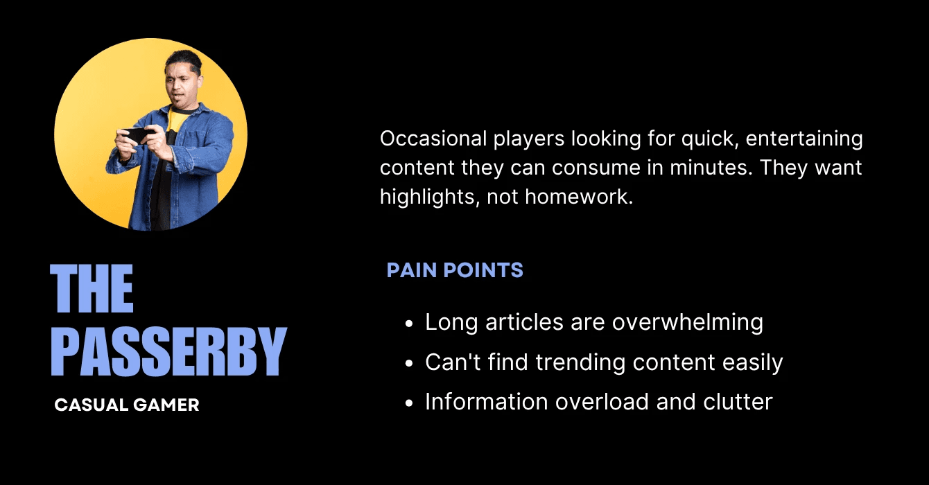
PERSONALIZED DISCOVERY
Interest-based landing page helps both user types find what they want faster. Reduces search time by organizing by game interest.

QUICK VIDEO CONTENT
Short-form videos for casual engagement and entertainment. 75% of users prefer mobile video content.

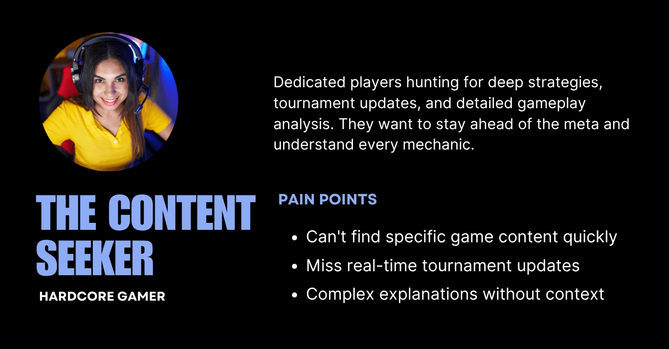
LIVE SCORE
Live scores and tournament tracking for hardcore fans. Creates reason to return during tournaments.
CHAPTER 4 : DESIGN DECISION AND TESTING
Turning strategy into screens
Having a strategy is one thing. Executing it is another. For each major feature, I designed multiple concepts and tested them with real users through usability testing
1
Choosing the right landing page approach
I tested two concepts: a traditional news hub vs. a real-time update feed.

Comprehensive News Platform

Live Update Hub

THE INSIGHT
Users needed both — they wanted to discover news by interest but valued live updates when tournaments were happening. I chose the "Live Update Hub" that surfaced real-time scores while maintaining browsable categories.
2
Making video content discoverable
Short videos were key for casual users, but how should they browse them?

Categorized Short Video

Story Highlights
THE INSIGHT
Testing showed users preferred categorized videos with visible covers over an endless story-style feed. They wanted to choose videos by topic before committing to watch.
3
Creating tournament tracking that eSports fans actually want
Hardcore gamers needed real-time tournament updates, but existing sports apps weren't designed for eSports behavior.

THE INSIGHT
Users who already have an interest in certain games tend to be used to looking for tournaments based on games
CHAPTER 5 : THE FINAL DESIGN
What we built
After multiple rounds of testing and refinement, here's what shipped. Three features working together as one cohesive experience — each solving a specific user need while connecting seamlessly to the others.

Personalized Discovery
A landing page that balances real-time excitement with organized discovery. Live tournament scores sit at the top, pulling in hardcore gamers during events.
Below that, content is organized by game interest — letting users find exactly what they want without endless scrolling.
Categorized Video Hub
Short-form gaming content organized by game and topic, not just thrown into a random feed. Users see covers and titles before committing to watch, making it easy to find what they're interested in while still enabling discovery of new content.


Tournament Command Center
Live tournament tracking built specifically for eSports fans. Filter by game to follow only the tournaments you care about. Vote for teams to increase engagement. See full schedules so you never miss a match. It's not just scores, it's a reason to keep coming back.
CHAPTER 6 : THE IMPACT
Did it actually work?
Three months after launch, the data came in. The multi-format strategy didn't just improve engagement — it transformed DG News from a struggling content section into a thriving gaming community hub.
+10.5%
+39
+134%

CHAPTER 7: REFLECTIONS & WHAT'S NEXT
What this journey taught me
We're in the middle of this story, not at the end. Milestone 1 is done, Milestone 2 is in progress. But already, I've learned lessons that'll stick with me for the rest of my career.
Not every user needs everything
The biggest insight wasn't about features — it was about letting users self-select their experience level. By creating distinct pathways instead of one bloated interface, we served both groups better.
Real-time content changes behavior
The 134% increase in returning users happened because live scores gave people a reason to come back multiple times during tournaments. Design for moments worth revisiting.
What I'd do differently
Validate content production earlier. We had the feature, but content became a bottleneck. Next time, I'd involve content ops in prototyping to catch implementation challenges sooner.
"This project reminded me that great UX isn't just about making interfaces pretty or flows smooth. It's about understanding that different users have different needs — and giving them the power to choose their own experience."
— My biggest takeaway from this project
More Projects Worth Exploring


© 2026 — Designed by Nindy A Dewi • Made in Framer