

Ecoflow
EcoFlow is a travel app concept designed to make Bali tourism more seamless, fair, and sustainable. Powered by real-time telco data, the app helps travelers avoid overcrowded spots, supports local businesses, and rewards eco-friendly choices.
Client
Telkomsel
Service Provided
UI/UX Design Lead
YEAR
2025
MY TEAM
Product Manager
Data Scientist
Data Engineer
Back End Developer
Front End Developer
MY ROLE
As lead UI/UX Designer, I scoped the concept, ran user interviews & ride‑along research, mapped the IA and flows, designed high‑fidelity screens in Figma, built an interactive prototype, and moderated usability tests to validate core features.
4.3/5
600+
2 months
CHAPTER 1 : THE PROBLEM
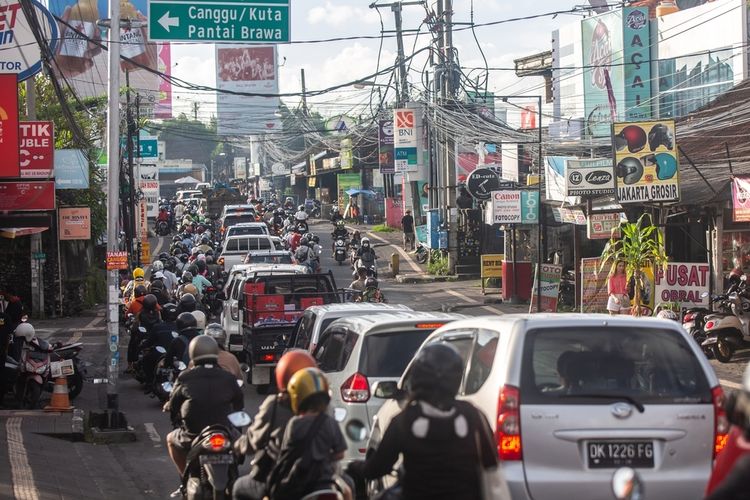
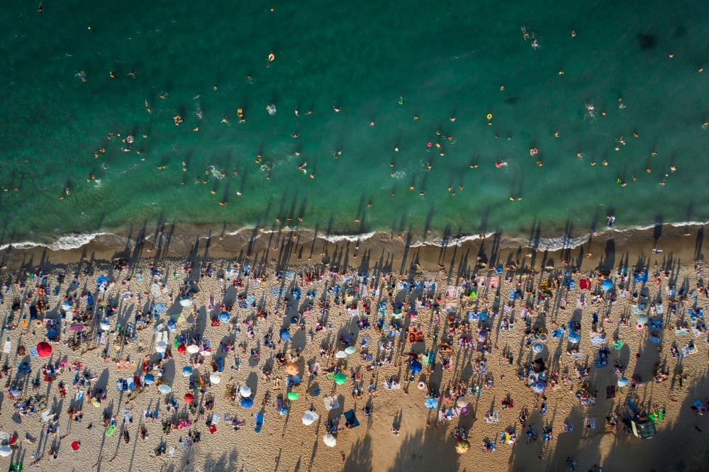
A trip to Bali always makes us excited—but not what comes with it
Stuck in traffic for hours.
Arriving at a destination only to find it overcrowded.
That moment when excitement turns into exhaustion.
"A trip to Bali always makes us excited, but not the idea of being stuck in traffic for hours, only to find out the destination is overcrowded."
Rizaldy - Traveller

Three problems, one messy situation
The Traveler's Dilemma

The Community Gap

The Invisible Impact
OUR MISSION
CHAPTER 2 : UNDERSTANDING REAL PEOPLE
We didn't start with assumptions. We started with listening.
Here's a truth about design:
You can't solve problems for people you don't understand. So we rolled up our sleeves and talked to travelers. Lots of them.

600+
User Surveyed
12
In-Depth Interview Conducted
— Daiva, 24, Traveler from Jakarta
The "Aha!" moments that changed everything

People would rather detour than deal with crowds
Users consistently said they'd change plans if they knew a place was packed. They didn't want warnings—they wanted alternatives.


Making sudden changes is stressful without a backup plan
"It's a hassle to make sudden changes when there's no plan B." People aren't afraid of change—they're afraid of the unknown.

Environmental impact? Nice idea, but not the main motivator
Users understood traffic reduction helps the environment, but it wasn't driving decisions. Their experience was the real motivator.
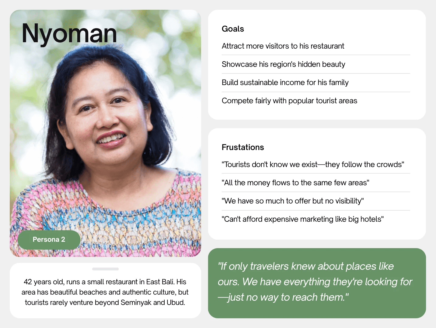
Meet Aileen and Nyoman—our design compass

CHAPTER 3: FROM INSIGHT TO ACTION
When good ideas meet reality—the messy, beautiful design process
So we had all this research. Stacks of interview notes, survey results, pain points highlighted in neon yellow. We knew the problems inside and out. Now came the hard part: turning insights into something people could actually use.
Turning research into structure
With insights in hand, we prioritized ruthlessly—choosing features that solved core problems over nice-to-haves. Before touching Figma, we mapped Aileen's complete journey: every decision point, every moment of friction, every question she'd ask. This became our filter: does this feature help her right here, right now?
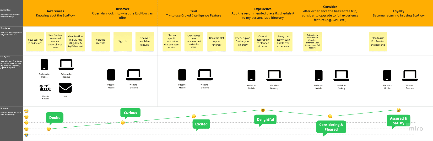
Sketching without overthinking
Armed with our journey map and priorities, we started sketching. The goal wasn't perfection, it was exploration.
"Our first sketches looked like a stock market dashboard. Beautiful, data-rich, and completely overwhelming. That's when it hit us: we're not designing for data analysts. We're designing for someone who just wants to know if they should go to the beach now or in two hours."
— Me, after our first reality check
Back to the drawing board. Simpler. Clearer. Less "look at all our data" and more "here's what you need to know."
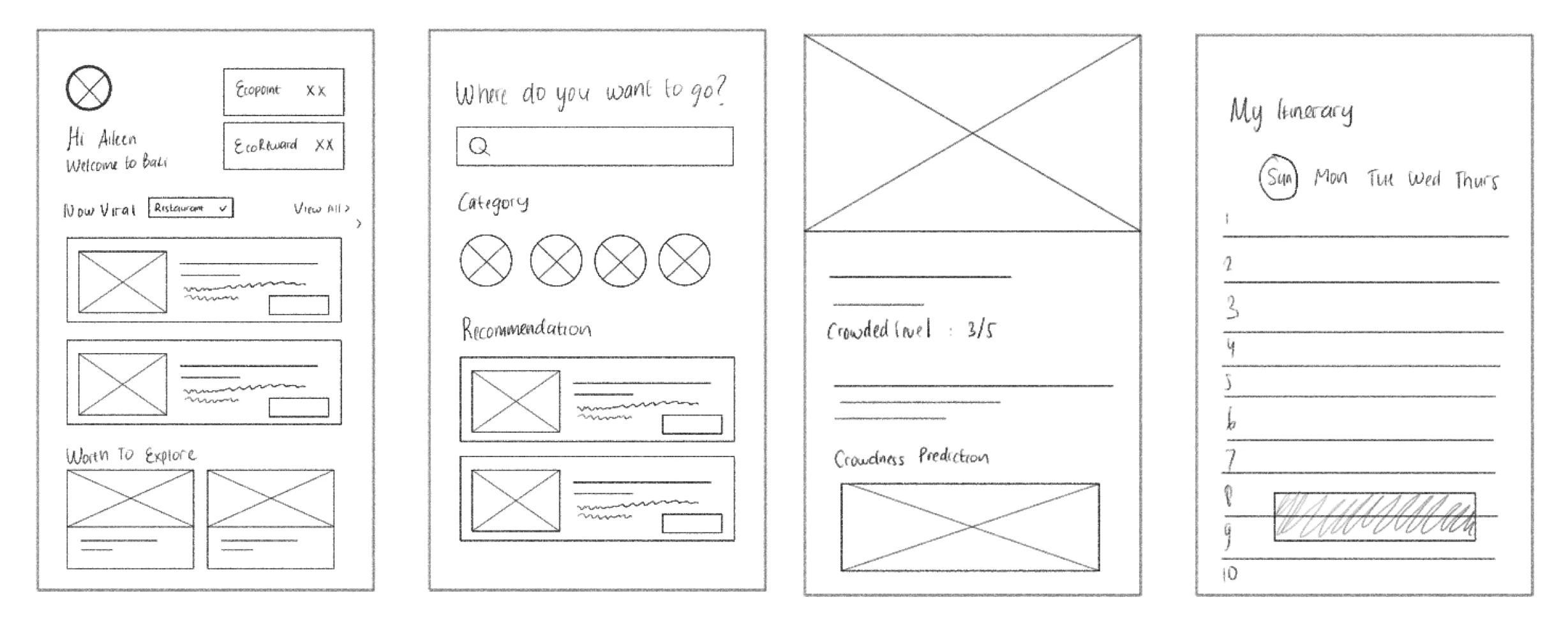
Digital wireframes
(still ugly, but structured ugly)
Best sketches moved to Figma. Still grayscale, still rough—but now we could click through them, test flows, see how it actually felt to navigate.

The iteration nightmare
(or, how we failed our way to success)
Let me tell you about our crowd intelligence feature—the core of the whole app. We rebuilt it. Three times. Each version taught us something painful but necessary.
Too much information - users felt overwhelmed
Too hidden - users couldn't find the feature
Contextual reveal - information appears when tapping a destination
The Design Principle That Emerged
When things started coming together
After all those iterations, something clicked. The pieces started fitting together. We knew what to build, how to structure it, and—most importantly—we'd already learned from our biggest mistakes in wireframes, not in code.
Time to make it beautiful. We brought in the real design: colors inspired by Bali (those greens and terracottas), clean typography, smooth interactions. But the foundation—the flows, the information architecture, the timing of when things appear—that was already solid.
The Final Design
Where data becomes decisions: four features that solve the core problems

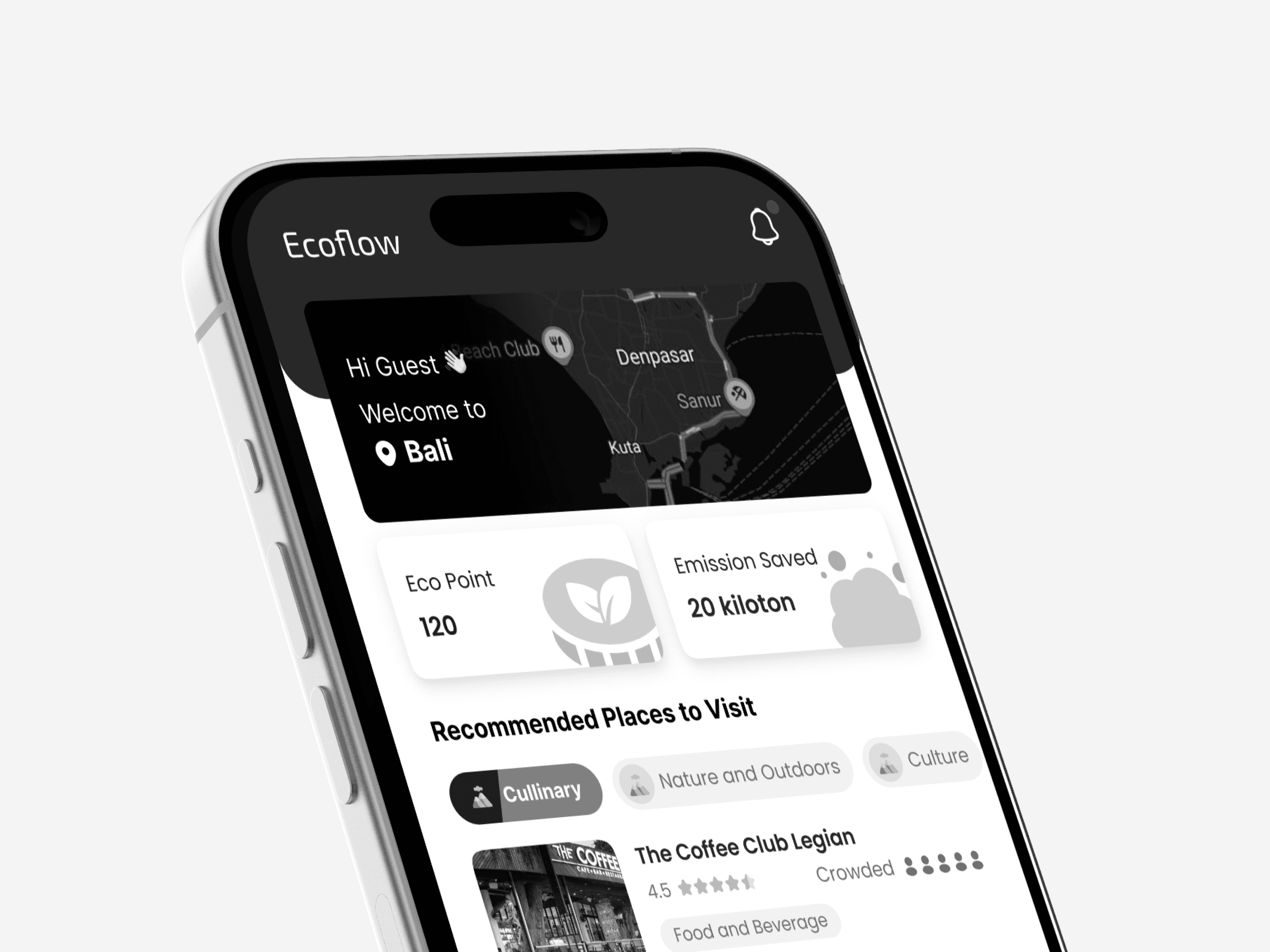
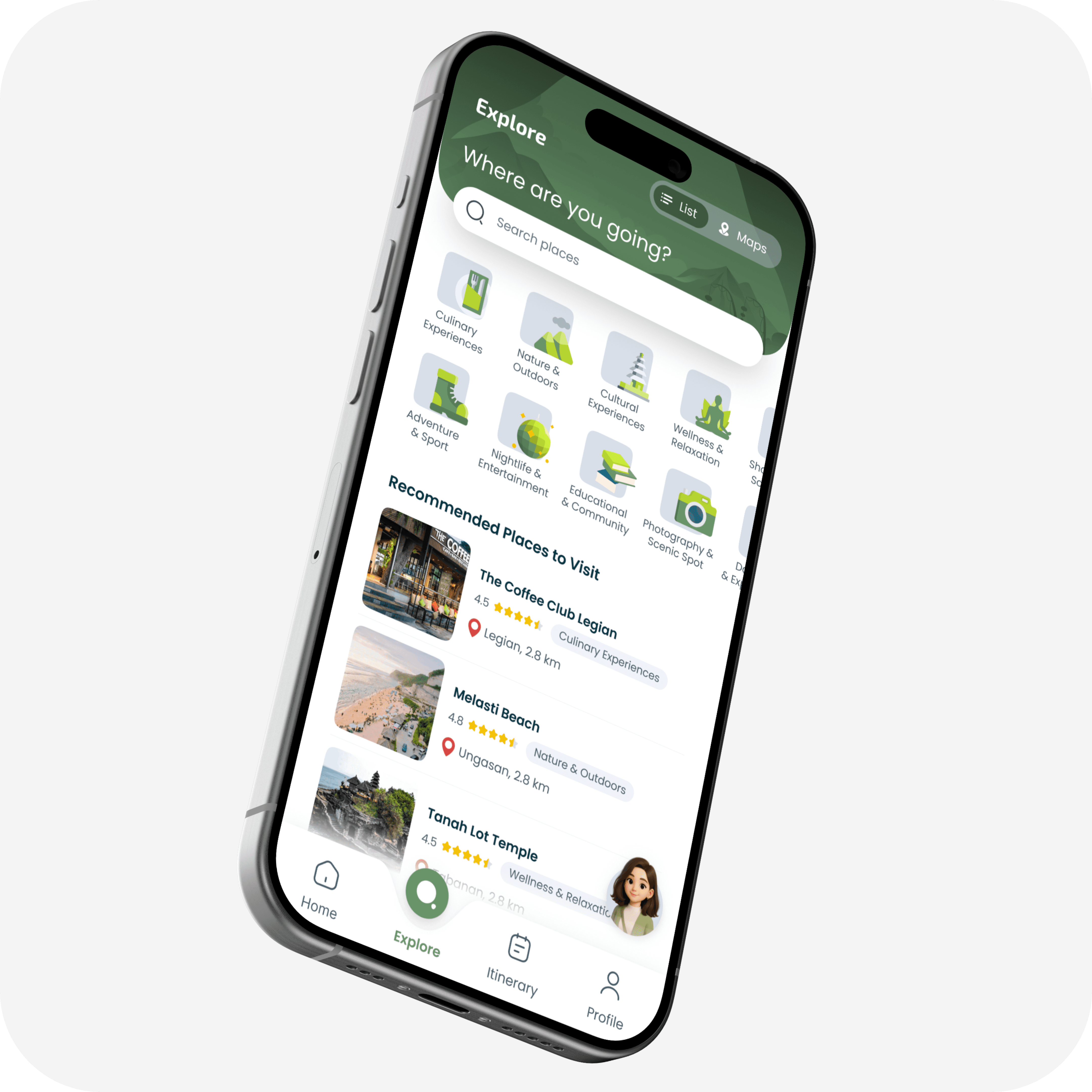
Home Dashboard
Real-time EcoPoint tracking shows environmental impact while personalized recommendations surface nearby destinations based on current crowd levels and user preferences.
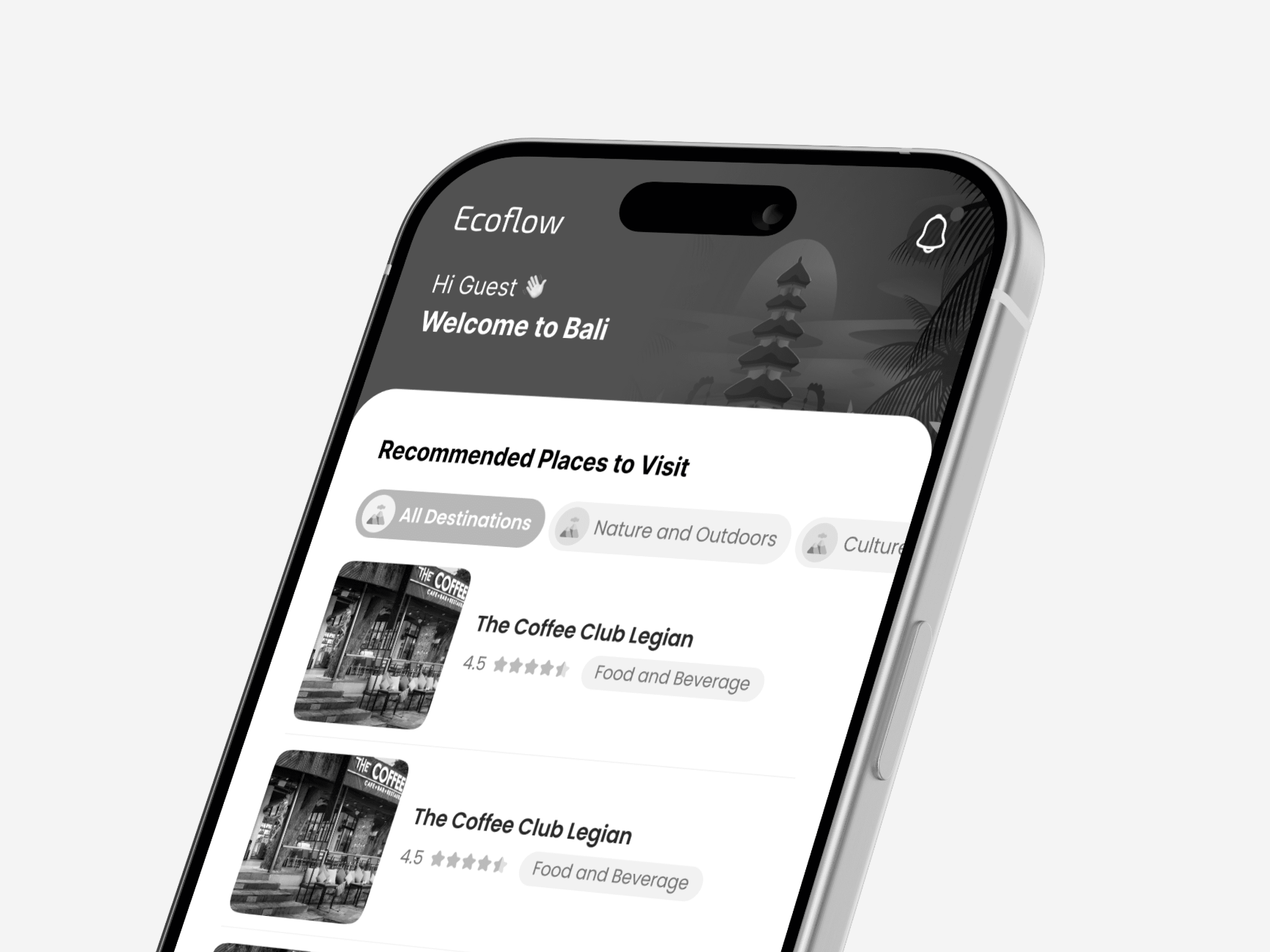
Smart Explore
Category-based discovery with instant filtering by interest type—from culinary experiences to wellness retreats.
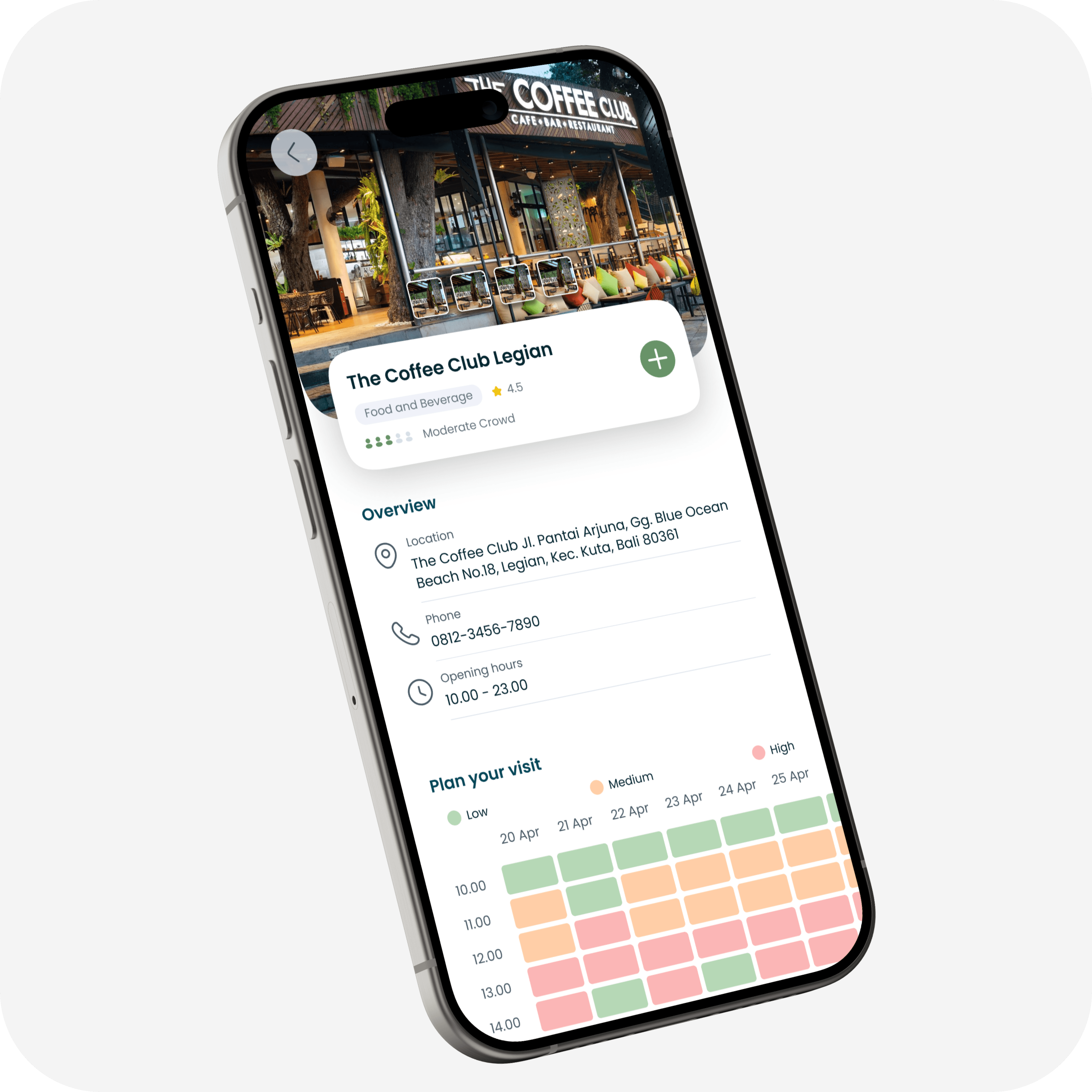
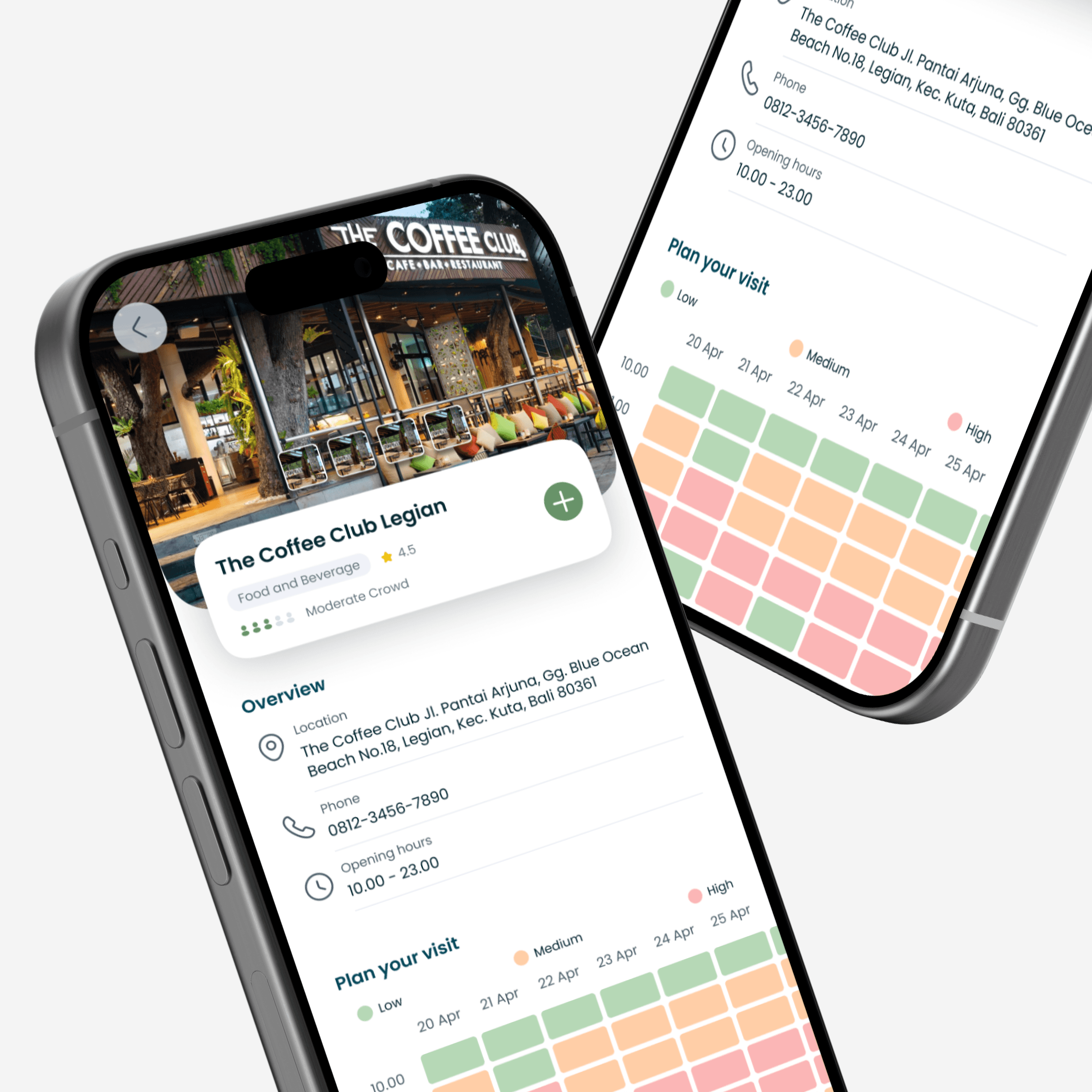
Crowd Intelligence Detail
The heart of the system: a visual heatmap displays 5-day crowd predictions by hour. When a destination shows high traffic, alternative suggestions appear automatically.
Adaptive Itinerary
Timeline view integrates scheduled activities with real-time crowd data. Users see their daily environmental impact and can adjust plans on the fly when crowd levels shift.

CHAPTER 4: REALITY CHECK
When real users tried our "perfect" design
Spoiler: It wasn't perfect. But that's exactly what testing is for.
The Result
Through moderated usability testing with our target users, we focused on deep qualitative feedback over broad metrics.
4.5
4.5
4.5
4.0
4.0
Key Testing Insight
Using the Single Ease Question methodology, an average rating of 4.0 is considered good usability. We hit 4.3—above the threshold, but with clear room for improvement.
What users actually said
"So useful! When I click on red (busy times), it shows alternatives. This raises awareness. If you add route features, I'd use EcoFlow over Google Maps!"
— Clairine, 18, Female, Traveler
"Berhasil, looks okay, sangat membantu. (Successful, looks good, very helpful.)"
— Davin, 19, Male, Traveler
The Fix That Changed Everything
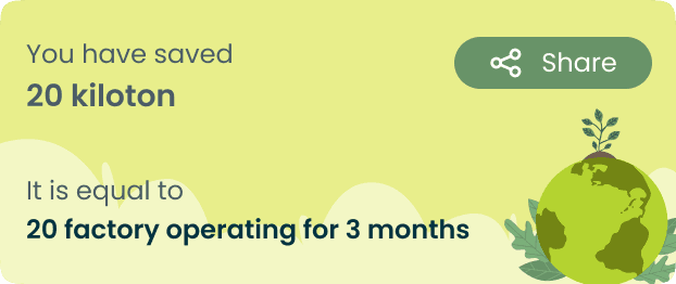
During testing, users weren't understanding our EcoPoints system. "Why should I care about points?" One simple change—showing the real-world environmental impact—increased comprehension by 60%.
CHAPTER 5: REFLECTIONS & WHAT'S NEXT
What this journey taught me (so far)
We're in the middle of this story, not at the end. Milestone 1 is done, Milestone 2 is in progress. But already, I've learned lessons that'll stick with me for the rest of my career.
Data without context is just noise
Raw telco data wasn't useful until we turned it into decisions: "Should I go now or later?" Design bridges the gap between information and action.
Systems thinking beats feature thinking
Every feature had to benefit multiple stakeholders—tourists, local businesses, the environment—or it didn't make the cut. The best solutions improve the entire system.
Constraints make you sharper, not weaker
Six weeks and limited resources forced us to ask: "What actually matters?" Constraints don't limit creativity—they focus it.
"EcoFlow taught me that great UX isn't just about making interfaces pretty or flows smooth. It's about understanding complex systems—people, communities, environments, economics—and designing solutions that lift everyone up, not just the end user."
— My biggest takeaway from this project (so far)
The roadmap: What's coming next
We're currently wrapping Milestone 2 (Itinerary Planner + eFlo Assistant + Integration). But this is just MVP. Here's where EcoFlow could go:

More Projects Worth Exploring


© 2026 — Designed by Nindy A Dewi • Made in Framer